EXPERIENCE 1
Aggregate Student Insights


Help teachers gather insights from tools they already use into one location.
Problem
Our first release focused on getting a product out the door with basic functionality such as a content library as well as a read-only attendance tracker and grade-book widget. We tried to create visualizations that showed how classes and students were doing over time, but found bugs when we imported actual data because it was all so vastly different. We needed to figure out a way to deliver valuable insights, create a navigation that scaled, and last but not least, we really needed to ensure that our product was accessible to everyone.
Solution
While our developers worked on the various bugs and analytic improvements, our visual designer, Chase Kettl and developer, Chengqi Zhu established a new, accessible style guide which helped me to create our Sketch symbols, master file, and high fidelity wires at a faster rate. I used this time to build a site map and a case for updating our navigation so that in the future we could add pages for other concepts such as a unit builder.
Deliverables
Navigation update
Created a master file and the symbols for each component
Created an Invision demo of the entire product to empower our offering management and sales team at client visits and conferences
Next Steps
We needed something to make our offering transformative in the education market and few competitors were utilizing years of student data to pinpoint gaps in knowledge levels. Most offerings showed what was happening with students right now instead of considering prior gaps and how they influence student learning today. Unfortunately, we were no closer to this goal than our competitors, but identified that was where we needed to focus some of our efforts.
EXPERIENCE 2
Class & Student Mastery


Show teachers who is struggling, why, and what they can do about it.
Problem
In our first attempt at communicating student mastery, I reimagined a design we inherited from IBM Research, turning it into something that I hoped was more understandable and usable to all teachers. I concluded that we needed to show teachers student knowledge levels in the context of the curriculum hierarchy that they are familiar with (Domain > Strand > Cluster > Standard > Sub-Standard) in real time, as the year progresses. From there, we collected feedback where we heard that now that teachers could see what was going on with their students, they wanted to also know "Why?". "Why does the student have low mastery on that standard and what can I do about it?"
Solution
I dove deeper into learning about student knowledge levels by reading literature, visiting schools and sorting through student data. I learned how teachers track each student’s progress and how they keep track of their entire class (or multiple classes in the case of High School teachers) then used that to move backwards and potentially spot the root cause of a student’s learning gap. I then shared this with our data team and they created a way to do this using analytics. More details about the approach for student and class mastery are outlined below.
Contributions
Competitor Analysis
Information Architecture
Research of Student Knowledge Levels, Curriculum, Testing Practices, Learning Progressions, Scaffolding
Was a key influencer and lead UX designer responsible for the overall strategy for student and class mastery
Wrote help text so that teachers understood how each widget could help them
Led brainstorming / wire-framing sessions and facilitated workshops
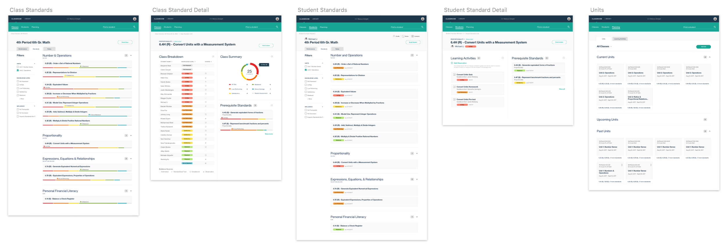
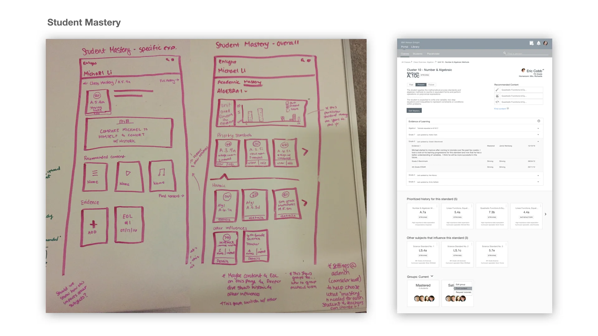
STUDENT MASTERY
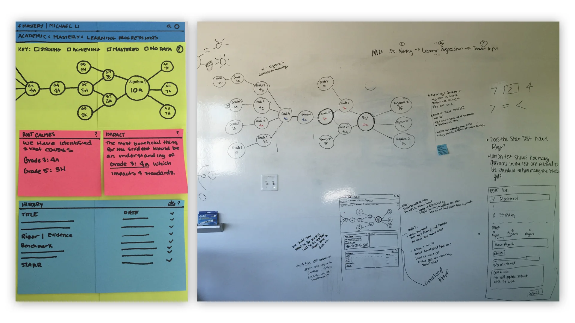
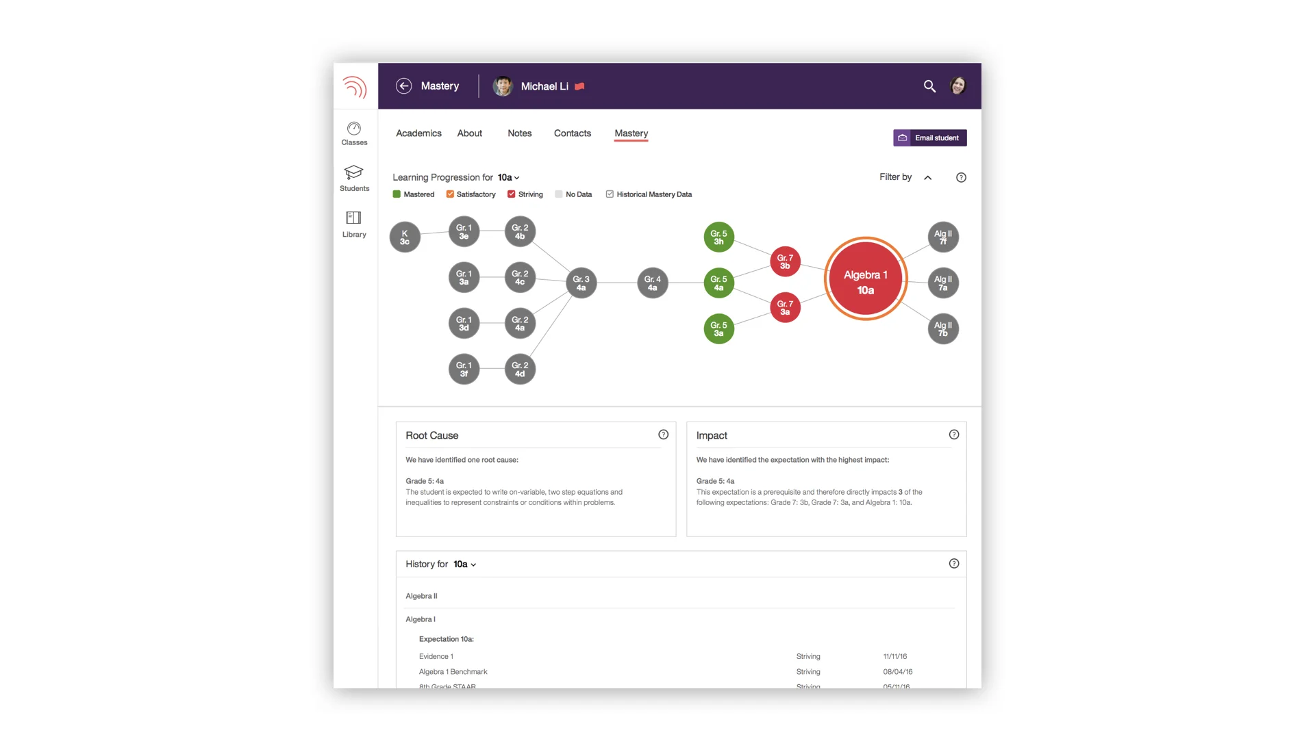
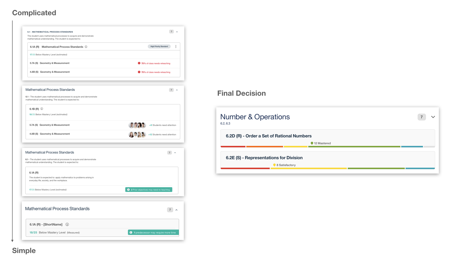
Problem: Our teachers thought the "Dandelion" visualization for each student was overwhelming, so I needed to figure out how to make this design more simple. Not only was it visually complicated, but it did not track student learning year over year, nor did it update in real time as we had originally intended. This was mostly a problem with our data model that needed design to help influence how it would be re-structured for future use.
Outcomes: I worked closely with our data scientist to identify and create a model that used learning progressions so that teachers could view prerequisite standards in prior grade levels to determine where a student first started having trouble and begin re-teaching from there to have more success in their lessons.
Contributions:
Sketched and prototyped a way for teachers to see real-time student knowledge levels and identify root causes of knowledge gaps.
Was selected to be the UX representative who would lead this effort moving forward.
Built a communication channel that previously did not exist with our data scientist, data architect, development, and delivery team to ensure that we were all on the same page and my ideas were feasible.
Next Steps: Feedback at this point was positive; teachers understood what we were conveying, but again, they thought the visualization was hard to parse and we recognized we would need something different if we were to show this information at a class level.

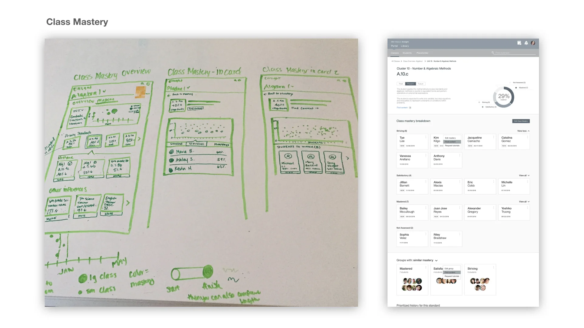


CLASS MASTERY
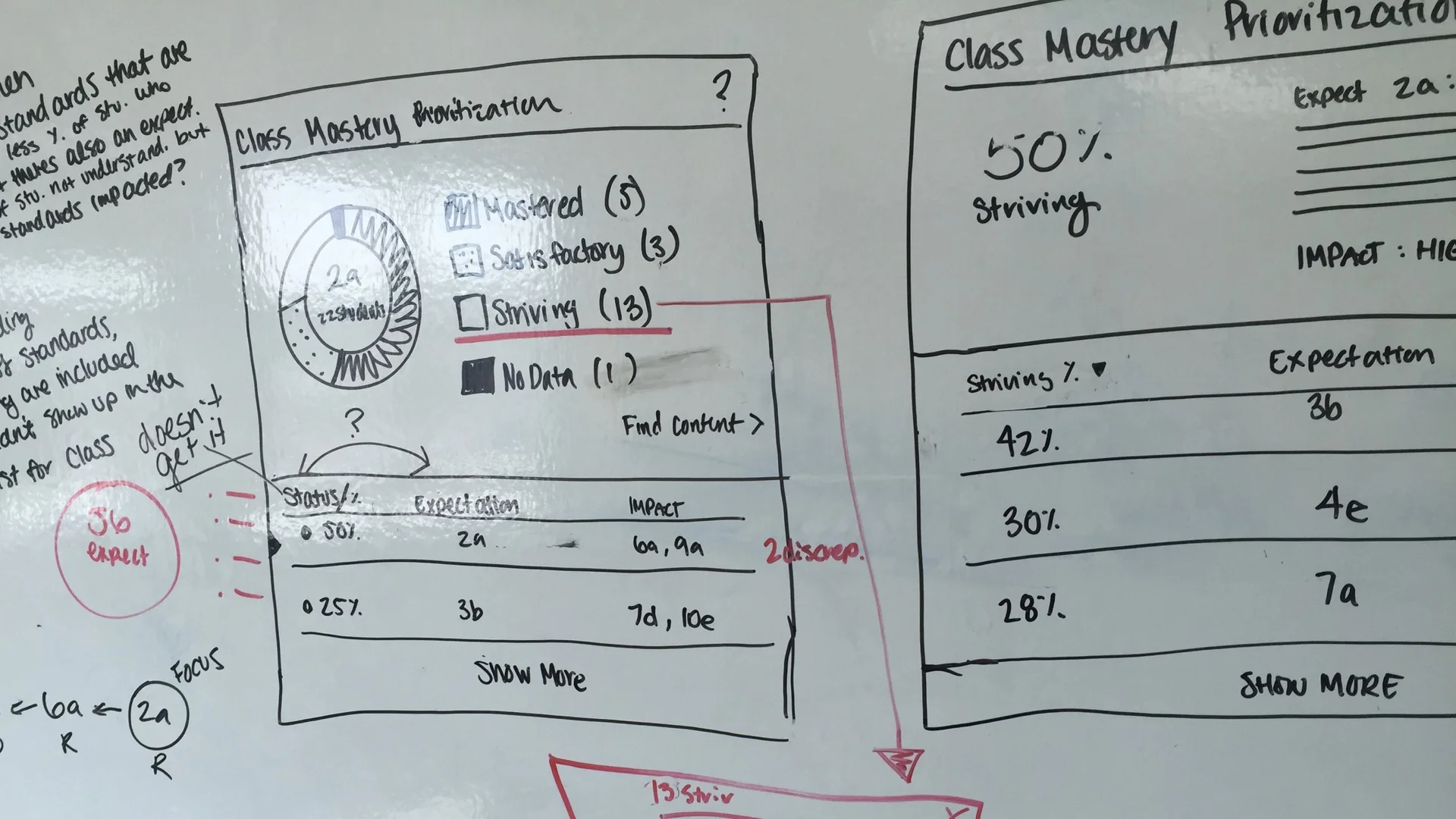
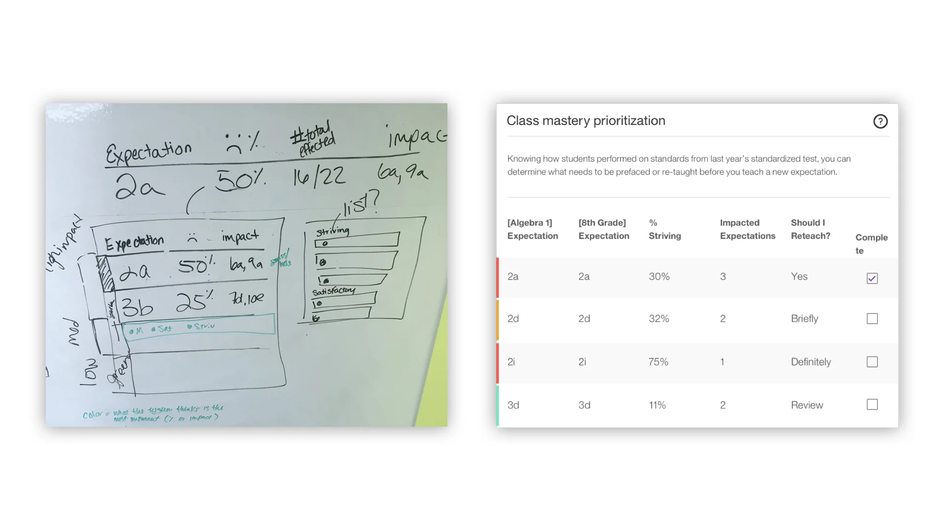
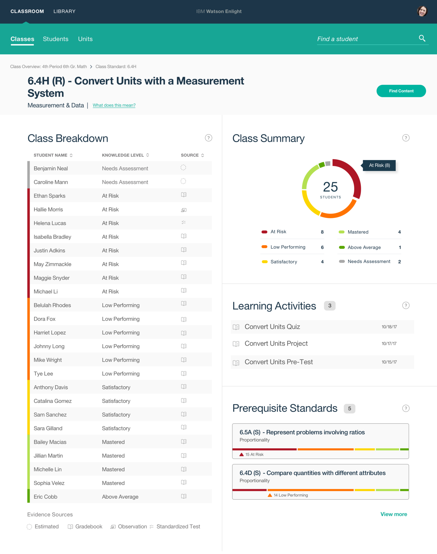
Problem: Now that the data model could support what we wanted to do, we needed an even more straightforward approach to help teachers understand student knowledge levels as well as the gaps across their entire class. At this point, we conducted many user sessions in which we used feedback to constantly update our visualizations and the data we were displaying to make sure our teachers weren’t overwhelmed with an abundance of information like they were previously.
Outcomes: We settled on showing teachers their standard data in cards. Now they could get a quick overview and investigate!
Contributions:
Organized and facilitated a data visualization workshop (15 in attendance)
Tested and simplified data by interviewing teachers
Shadowed teachers (middle school and kindergarten)
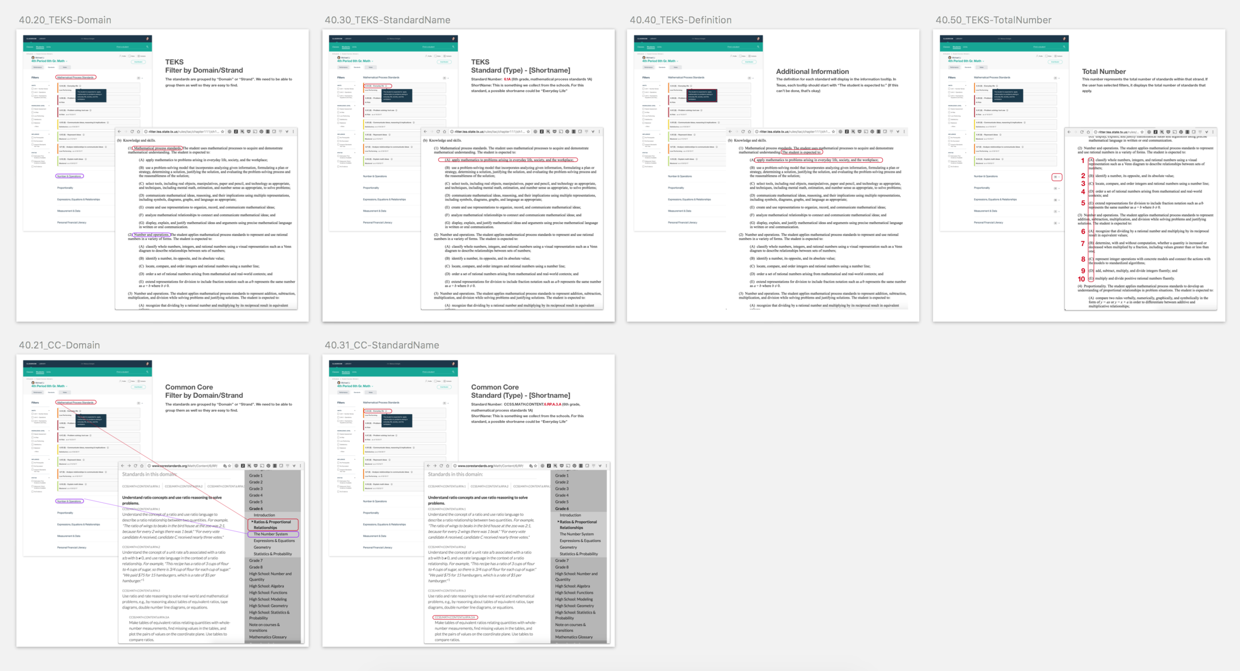
Showed how designs mapped to Texas curriculum (TEKS) as well as Common Core
Created over 10 completely different iterations of the entire experience.
Closed development defects and alterations needed after seeing how it worked with actual data
Next Steps: Our teachers could use the sort and filtering mechanisms to narrow down standards and understand which they should focus on first, but through testing we found that way of prioritizing wouldn’t work for teachers. They had a specific order in which things should be taught, so they couldn’t just pull up Enlight and focus on the areas that were the most “red”. They needed context of when a standard should be taught or a way to prioritize standards effectively.
ADDING AN OBSERVATION
Problem: Once the idea of capturing student knowledge levels set in, teachers wanted to be able to have their own influence. "What if a student has test anxiety but really knows the material?", "What if they got sick and were unable to finish a test?" - The list goes on. Elementary teachers, especially in the younger grades were extremely interested in this capability because their grading structure is vastly different. They grade based off teacher observation already, so this was a necessity, not a nice to have for them.
Outcomes: I worked with another designer on my team to create a way for teachers to add the type of observation and the knowledge level they believe a student to be at during that point in time. They can also attach evidence which could be a picture of a student’s work, a video of that student demonstrating skill, etc. so that other teachers or administrators can see that their actual knowledge is different than what grades are reporting.
Contributions:
Advocated to solve the problem
Site Architecture
Charged with ensuring consistency between Enlight and Element
Next Steps: We didn’t want to create a visual grade-book tracker, but setting knowledge levels for each student was also difficult and time consuming. Our next step was to identify a way to record the knowledge levels of multiple students across multiple classes all at once, while teachers were grading tests that were not in any order whatsoever. This was another challenge I finished but was unable to see in production after pursuing my next opportunity.
EXPERIENCE 3
View & Create Units
Help teachers prioritize the standards they will teach.
Problem: There is a certain order that standards are taught as some of them are dependent on one another within the school year. It doesn't matter if students are struggling with a standard that teachers haven't taught or won't teach until the end of the year, but it DOES matter that they don't understand something that’s already been taught or is coming up soon. We now needed to provide a way in which teachers could document which Standards would be taught when so that we could provide relevant information at the right time.
Outcomes: I researched units, or scope and sequence and created an experience in which our teachers could view a set of standards that they will be teaching at a point in time and evaluate/prioritize those standards. Most of our districts were creating unit plans for their teachers who would then create lesson plans based on this. So our goal was to create a digital way of documenting the units, thus giving a timeline for when standards would be introduced and become relevant to students.
Contributions:
Research into Scope & Sequence/Units and how they are used in the classroom using teacher interviews and online research
Testing of the information shown in the cards through teacher interviews
Overall user experience & prototypes to playback to our districts and for our sales team
Next Steps: We created a unit builder, but we needed a way to make this less labor intensive. Before moving to a new opportunity, I was exploring different ways to do this.