Jenn Wright
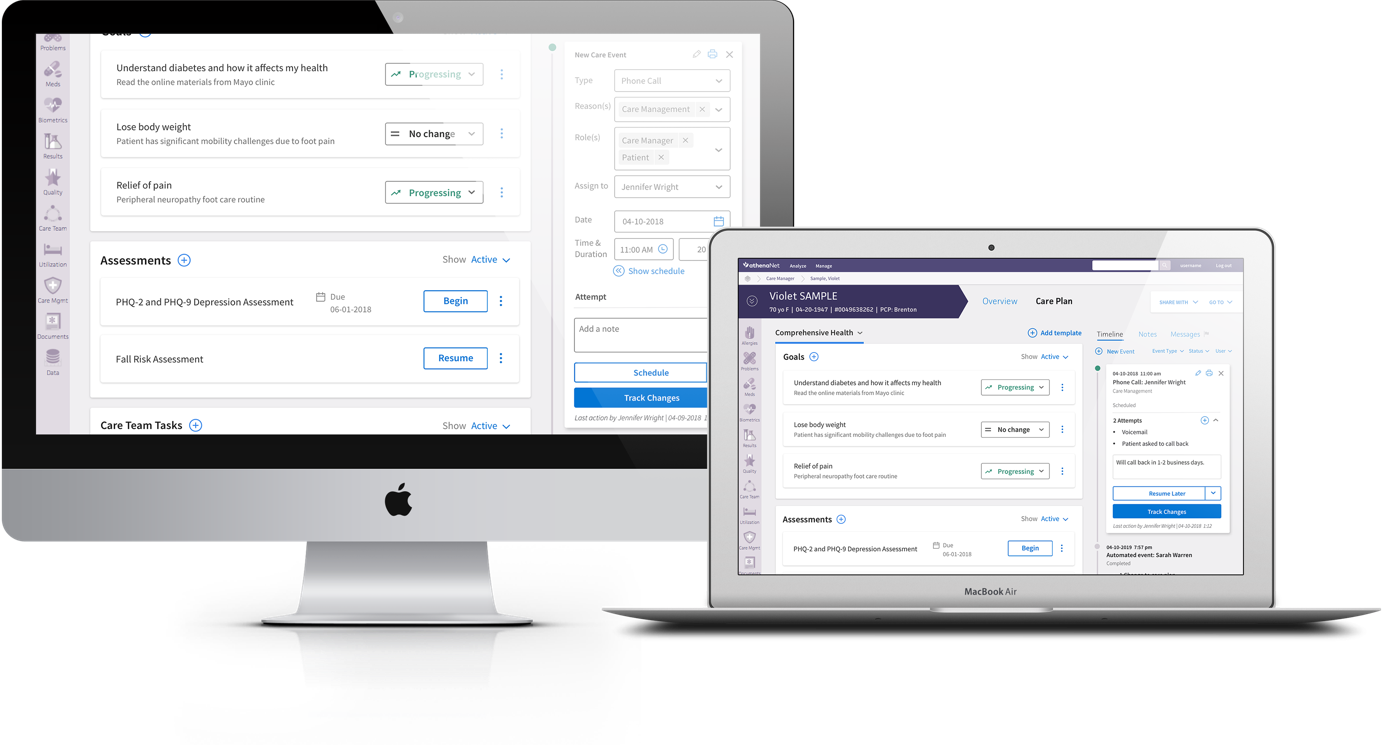
1_athena timeline mockup.png

Events Timeline

athenahealth | Care Management | Integrations

How we helped Care Managers track care plan changes and document a clinical encounter.


Understanding our Users

Research

My specific role was obtaining knowledge of athena’s Population Health and Clinicals products so that I could successfully integrate the care plan - which is a lot more complex than just surfacing a widget on a screen.

I participated in the following research activities to familiarize myself with the users, their workflows, and the products themselves.


WORKSHOPS
On-site workshops to journey map and understand the Accountable Care Organization’s (ACO) pain-points

INTERVIEWS
Care Managers took us through their current workflows

JOURNEY MAPPING
Research informed the wireframes which I then validated by Subject Matter Experts and my development team


Alpha Release

Integration Opportunities

Care Managers keep a personalized care plan for every patient they manage and document details about their care in the events timeline.

In our 2018 Jobs to Be Done survey, we found huge opportunities in improving the Care Manager’s ability to log activities and time, which was also essential to successfully integrating our care plan micro-service into Population Health.


Group 23.jpg

VIEW & EDIT THE CARE PLAN
Remove barriers to viewing and editing care plans


Group 21.jpg

TRACK CHANGES OUTSIDE EVENTS
All changes to a patient’s care plan must be associated to an event that can be billed for


Group 22.jpg

GET UP TO SPEED QUICKLY
Care managers must be able to review a patient’s history and notes quickly before reaching out


Alpha Release

Ship, Learn, & Iterate

We had two months to design and deliver a way to interact with the care plan outside of an event, so our strategy was to keep as close to the current functionality as possible while trying to make some minor improvements.

POSITIVE FEEDBACK

  • Clients loved quick access to patient care plans

  • Automatic events gave them confidence that all changes to a patient’s care plan would be logged
 
When Jenn joined the team back in April, she pretty much went through a trial by fire. We were trying to hit an aggressive deadline for 18.7 and there were still a lot of design decisions left to be made. Also, she joined arguably one of the most difficult projects at Athena, Pop-CMaaS integration. These changes touch one of the most used functionality in Pop, Person Center, and have a complicated history/detail behind each seemingly small component.
— JOE LI (TECHNICAL LEAD)
 
Blue Background.jpg

General Availability

Opportunities

Our alpha clients liked what we originally set out to do, but felt a couple new things needed to be addressed before making the care plan generally available.

We facilitated concept tests and interviews to understand more about the following areas, then circled back as we enhanced or created new experiences.


Group 23.jpg

REDUCE COGNITIVE LOAD
There were so many buttons and workflows users could access through the timeline and they needed to be streamlined


Group 21.jpg

LOCK EVENTS
Net New: Clients wanted events to lock and become a part of the patient’s permanent medical record


Group 22.jpg

LOG ATTEMPTS
Net New: Clients need to log and report when events are rescheduled, why, and how many times


Map it out

Reduce Cognitive Load

To reduce cognitive load, I mapped out the choices a user can make when creating/editing an event and where each action led. This helped to streamline buttons and save time when designing workflows to lock events.

With designs at this level, I was able to make changes to many states and see the impact of those decisions without having to flip through multiple art-boards.


Status Changes

Lock Events

In order for some events to lock and become part of the patient’s permanent medical record, we needed a smaller set of “true” statuses.

It wouldn’t be intuitive to have some of 14 statuses lock while others don’t, so we decided to separate the original list into “Statuses” and “Attempts”.

This allowed us to have 4 statuses: Scheduled, In Progress, Cancelled (Locked), and Completed (Locked).


Detailed reporting

Log Attempts

Care managers are often required to reach out to patients three times before they can switch focus to a new patient. They needed to be able to log their attempts to show that they made multiple efforts to reach out to patients.

When we enabled care managers to lock notes, we moved 10 of the previous statuses into the note details where they could describe how they attempted to reach a patient. We also made sure to add this into reports so that analysts could more easily track attempts as well.


Addtitional contributions

Status Mapping

In addition to designs and journey maps, I also wrote acceptance criteria, contributed to change management, and facilitated client feedback workshops. I also created the following diagram to aid discussions our team had with migrating old events to the new statuses.

 
AthenaDivider_Timeline-07.png

 DELIVERED JUNE 2019 | General Availability RELEASE

Release of Events Timeline

The events timeline was originally delivered in September 2018 to our alpha clients. After many feedback sessions with those clients, we made the events timeline generally available and migrated all our Population Health clients to CMaaS by July 2019.

This work is the inspiration and foundation for how a timeline should function when pulling data from Pop, Clinicals, and/or other products into one place. Our next step would be to use our learnings to create a Timeline micro-service.


I continue to be impressed and jealous, in a purely constructive way, of all the amazing work [Jenn] has done with the Population Health timeline. It is such a complicated feature and she does a good job to understand all the finer details needed for the best UX. In general, Jenn is very good at explaining her designs in a slow and detailed way. I even stole the idea she had for “journey mapping” the timeline for my own product because it worked so well to explain all the different edge cases and possible user interactions.
— Kay Maloney (Senior UX Designer)
 
Blue Background.jpg