overview of my experience at
MVNP
MVNP (formerly Milici Valenti Ng Pack) is an integrated advertising agency based in Honolulu, Hawaii, and an Affiliate Agency of DDB Worldwide. I worked with Volcano Vapors and also on our accounts with First Hawaiian Bank and First Insurance Company of Hawaii.
My Role
Competitive Analysis: I analyzed our competitors such as Chase, Bank of America, Citi, Bank of Hawaii, Capital One, etc. to understand what competitors are doing with their navigation.
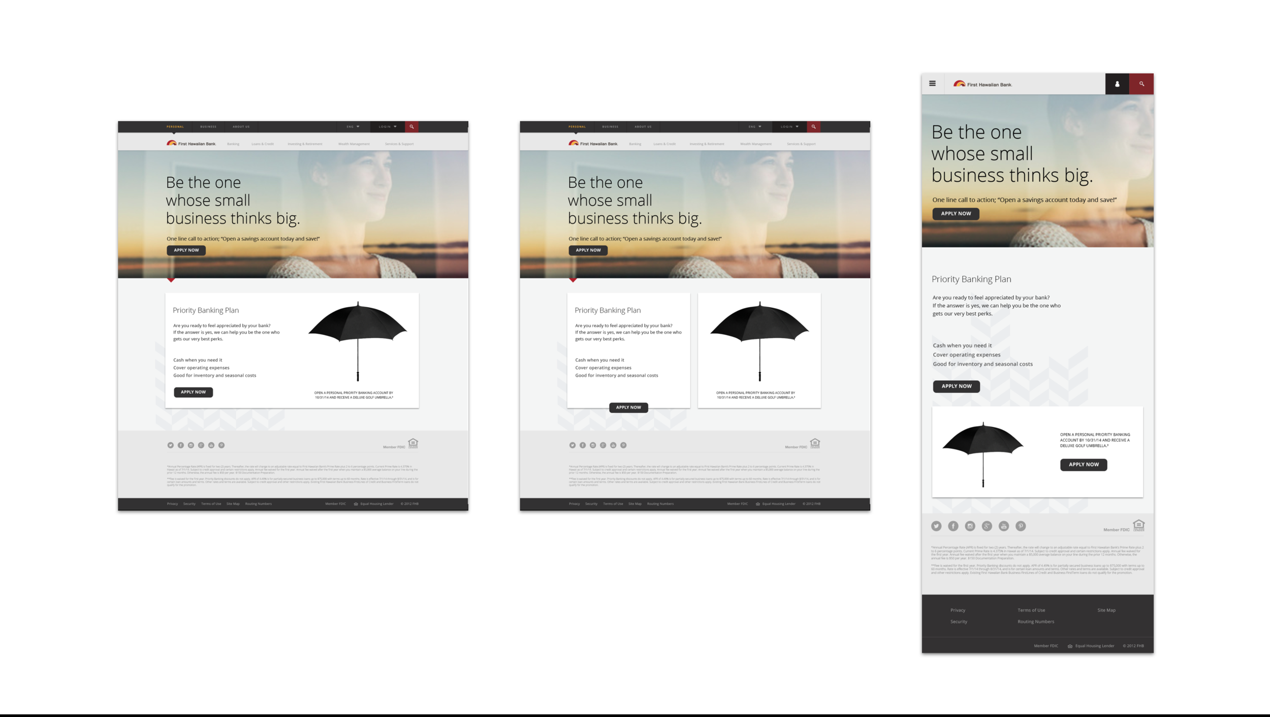
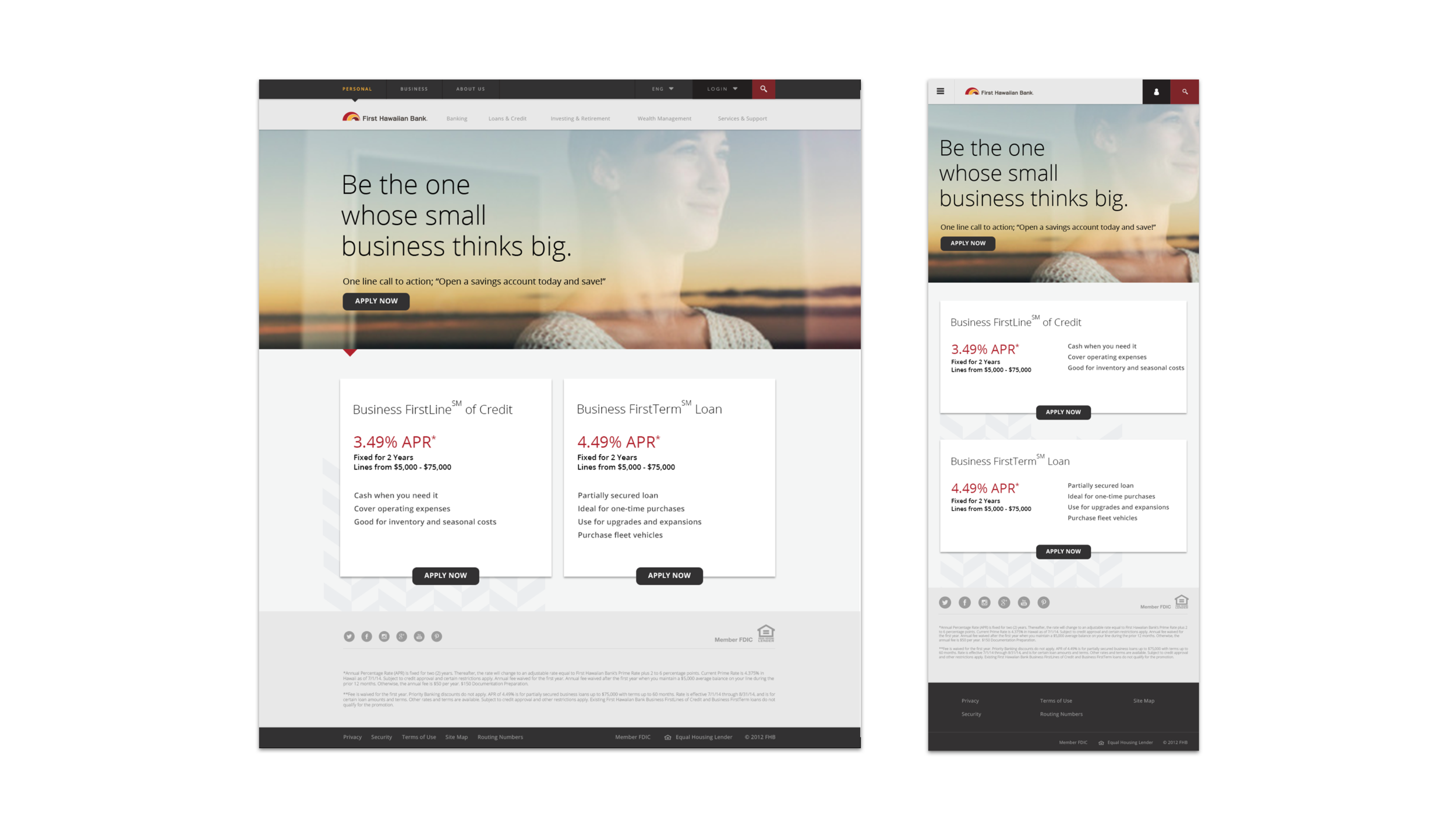
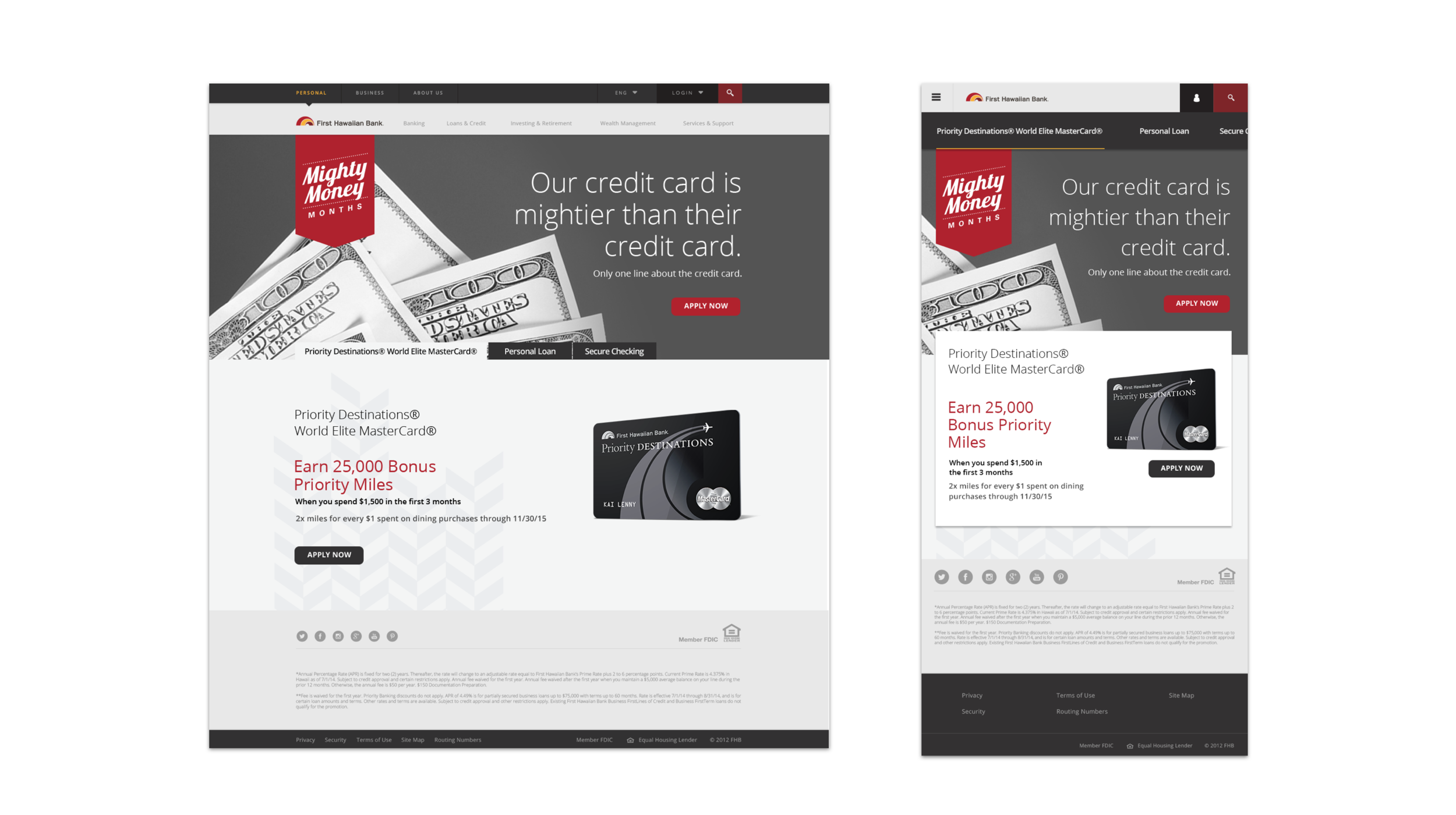
Wireframes: I created low, mid, and high fidelity wireframes for mobile and web using hand sketches, Adobe Illustrator and Photoshop.
Documented UX Responsibilities: I outlined the roles and responsibilities of a UX Designer for future use at MVNP.
Information Architecture: I created and used sitemaps to determine what aspects of navigation could be combined for less cognitive load on our users.

our Client
First Hawaiian Bank
First Hawaiian Bank is one of the largest banks in Hawaii and is also the beautiful building I had the opportunity to work in.
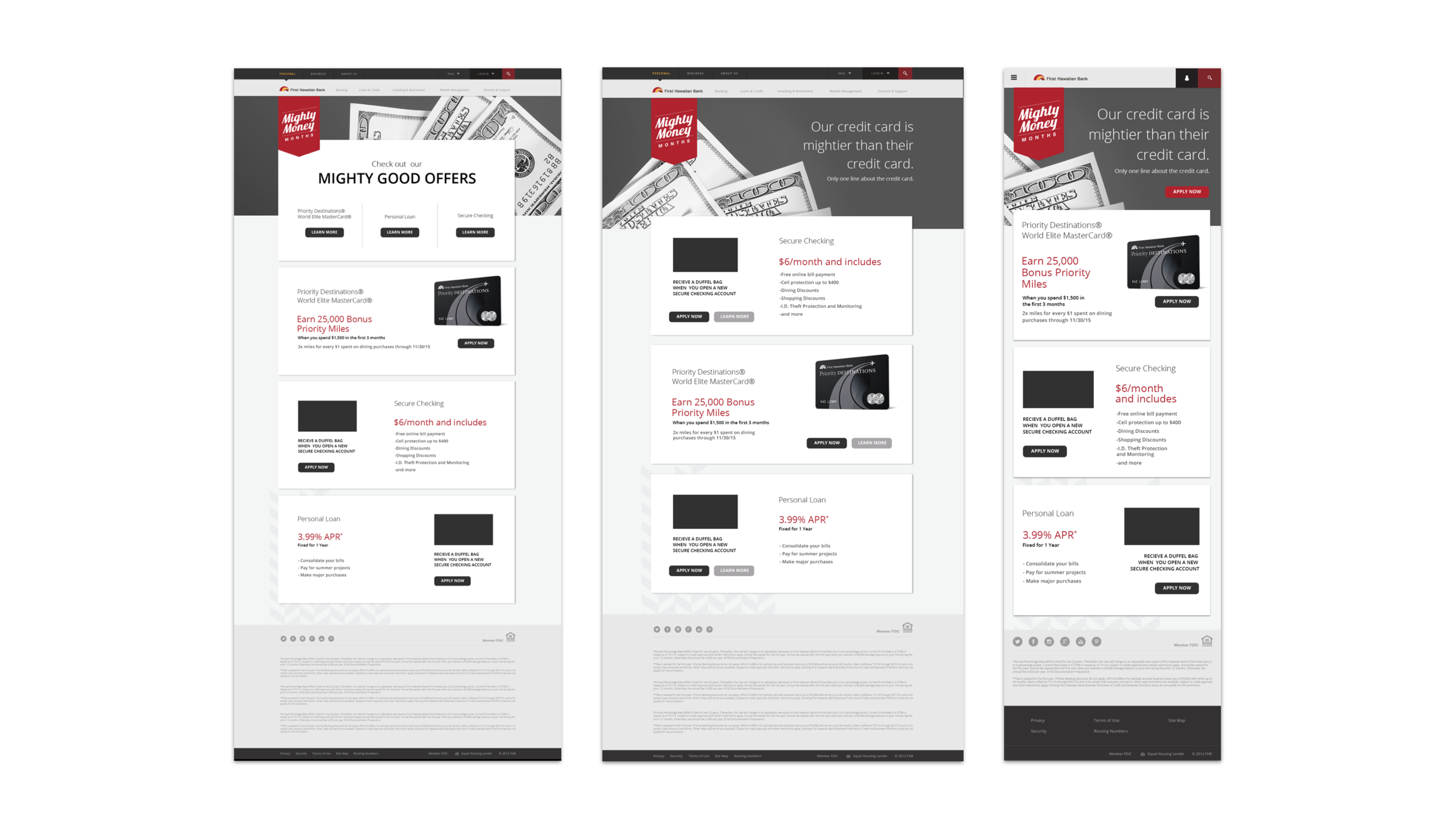
Problem: Each month the bank would advertise multiple promotions on their site and through email. This would require temporary landing pages that each had a very different design and unfortunately, weren't responsive so they were hard to see in an email.
Solution: In order to make sure designs were scalable and consistent, I completed a consistency audit to identify what elements could be re-used and for what purpose. I wireframed various templates that developers could add to a sandbox so and use when necessary. Shelby West then enhanced the wires with typographic information and used it in an advertisement for MasterCard.
Identifying Problem Areas
In order to make sure designs were scalable and consistent, I completed a consistency audit to identify what elements could be re-used and for what purpose. I identified three main areas for improvement.
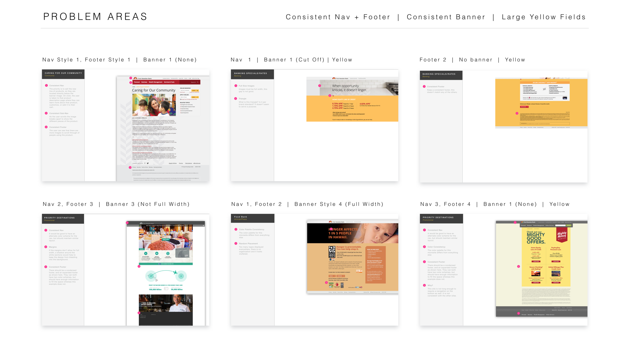
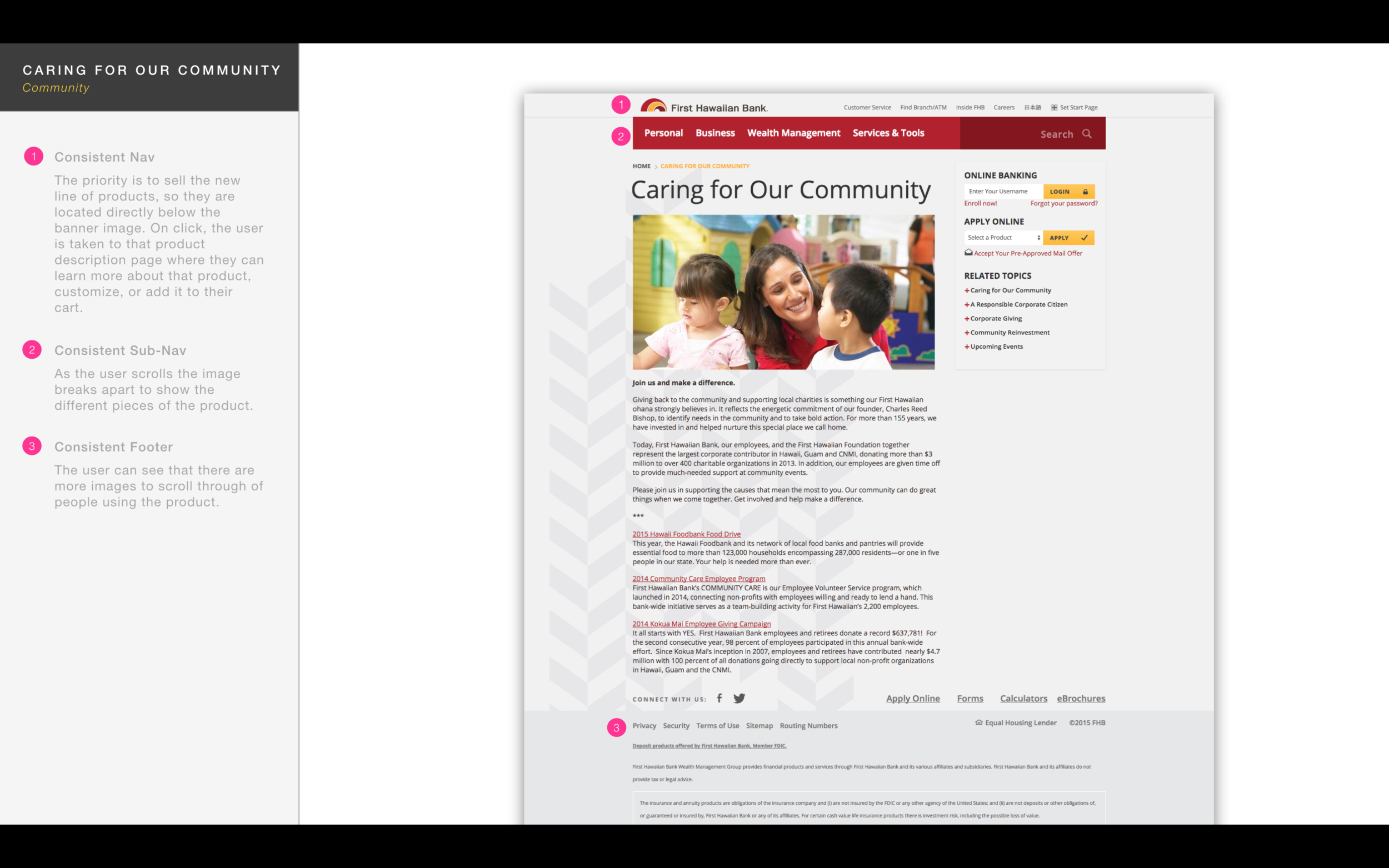
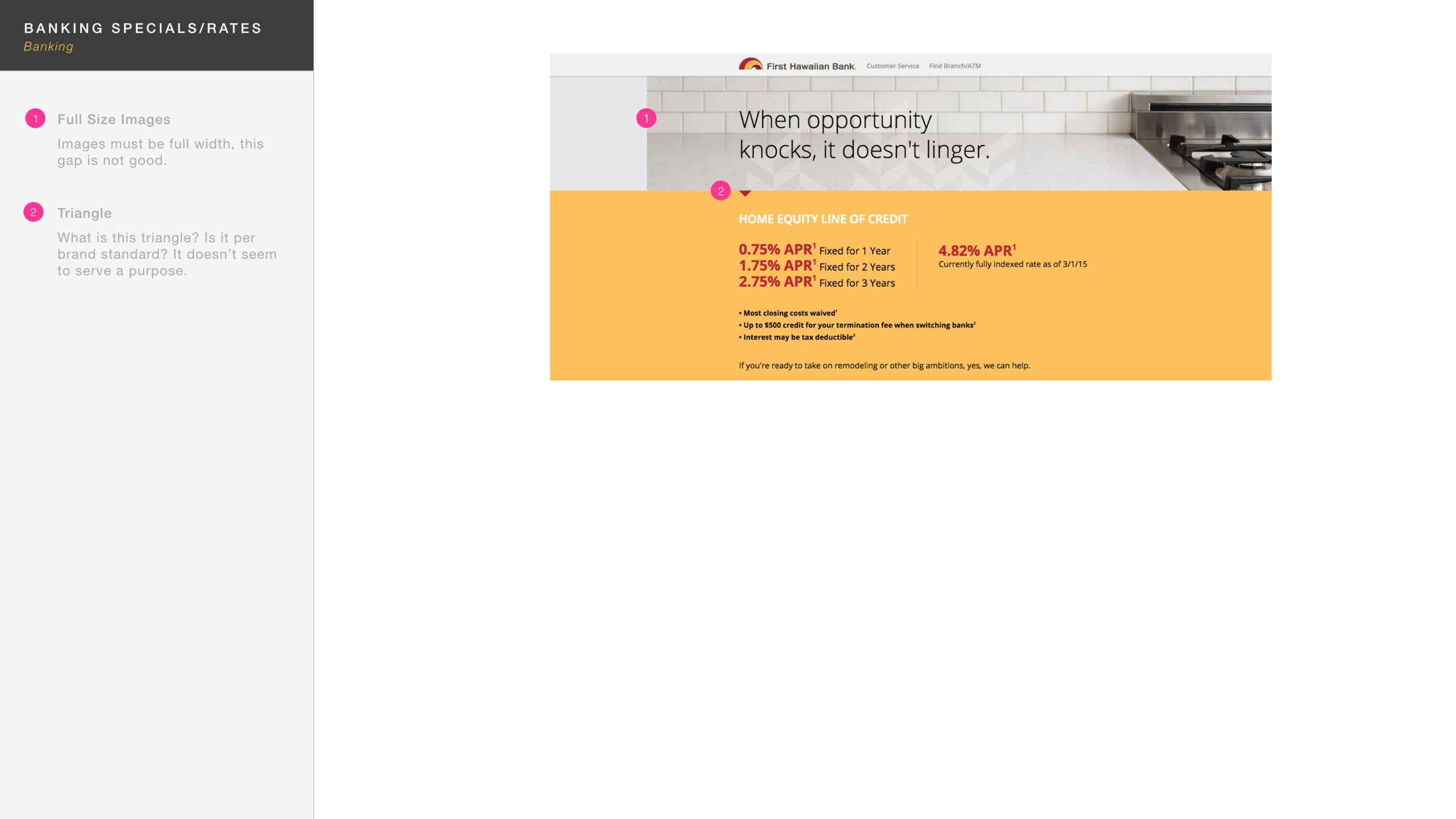
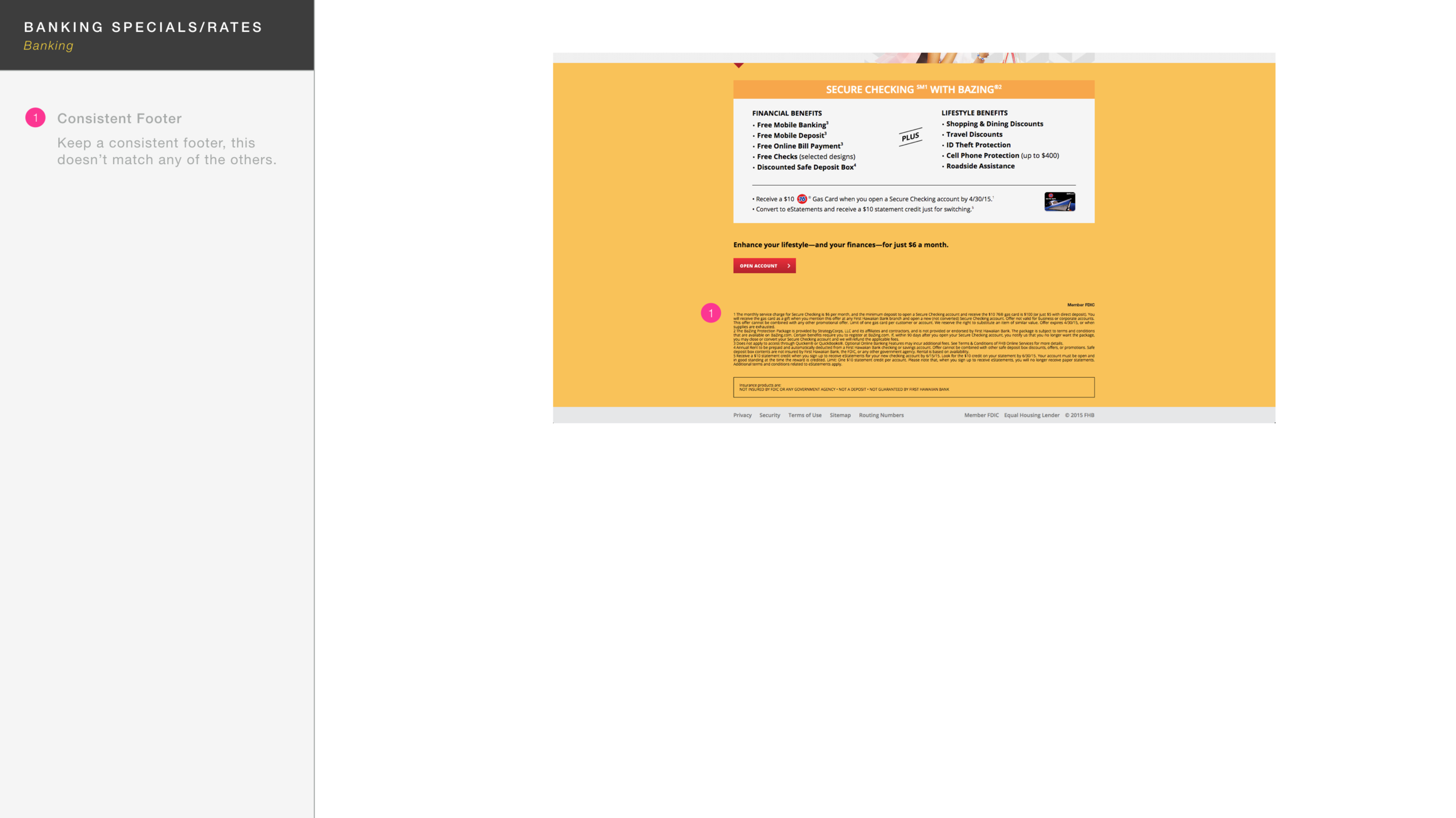
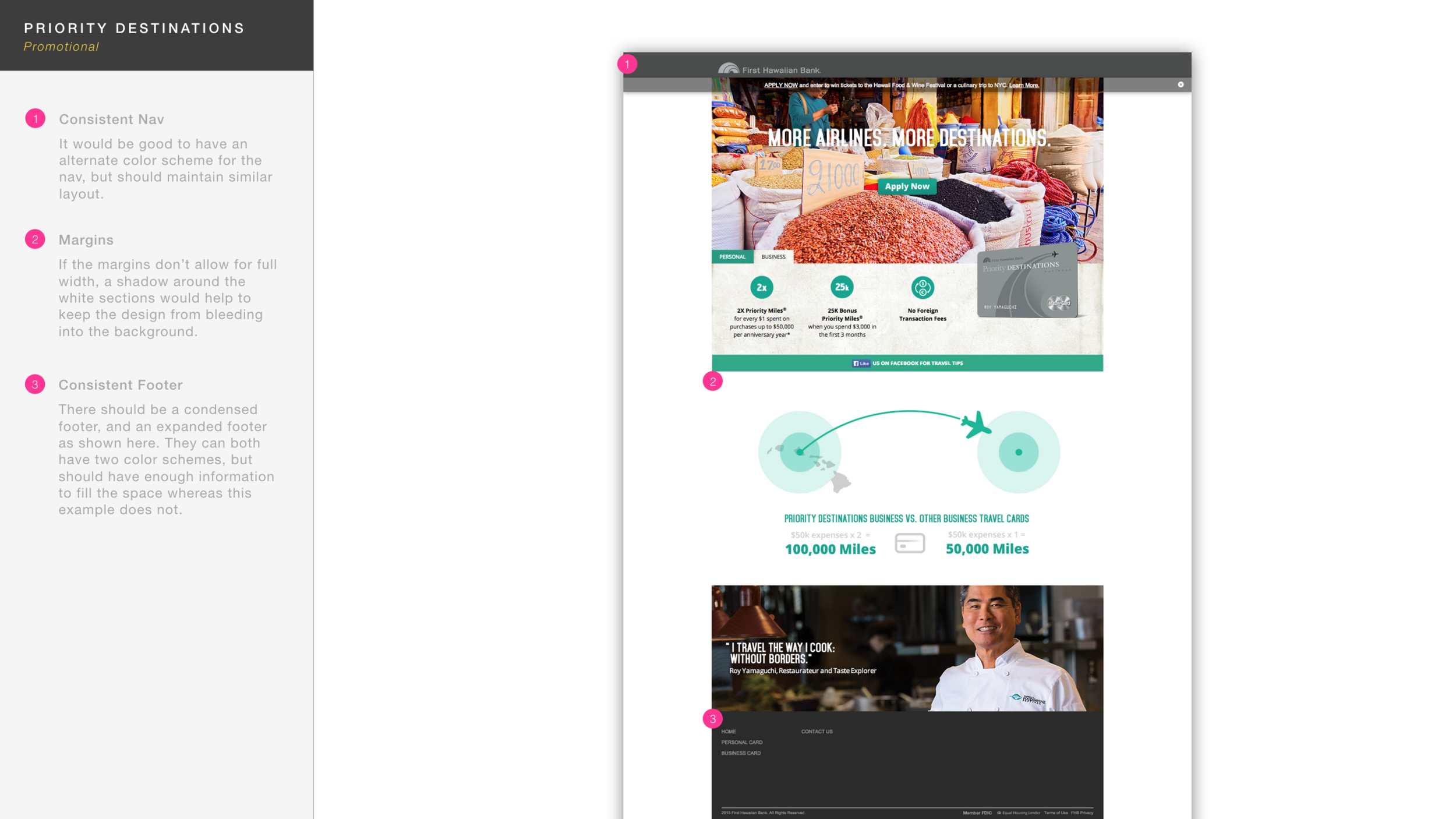
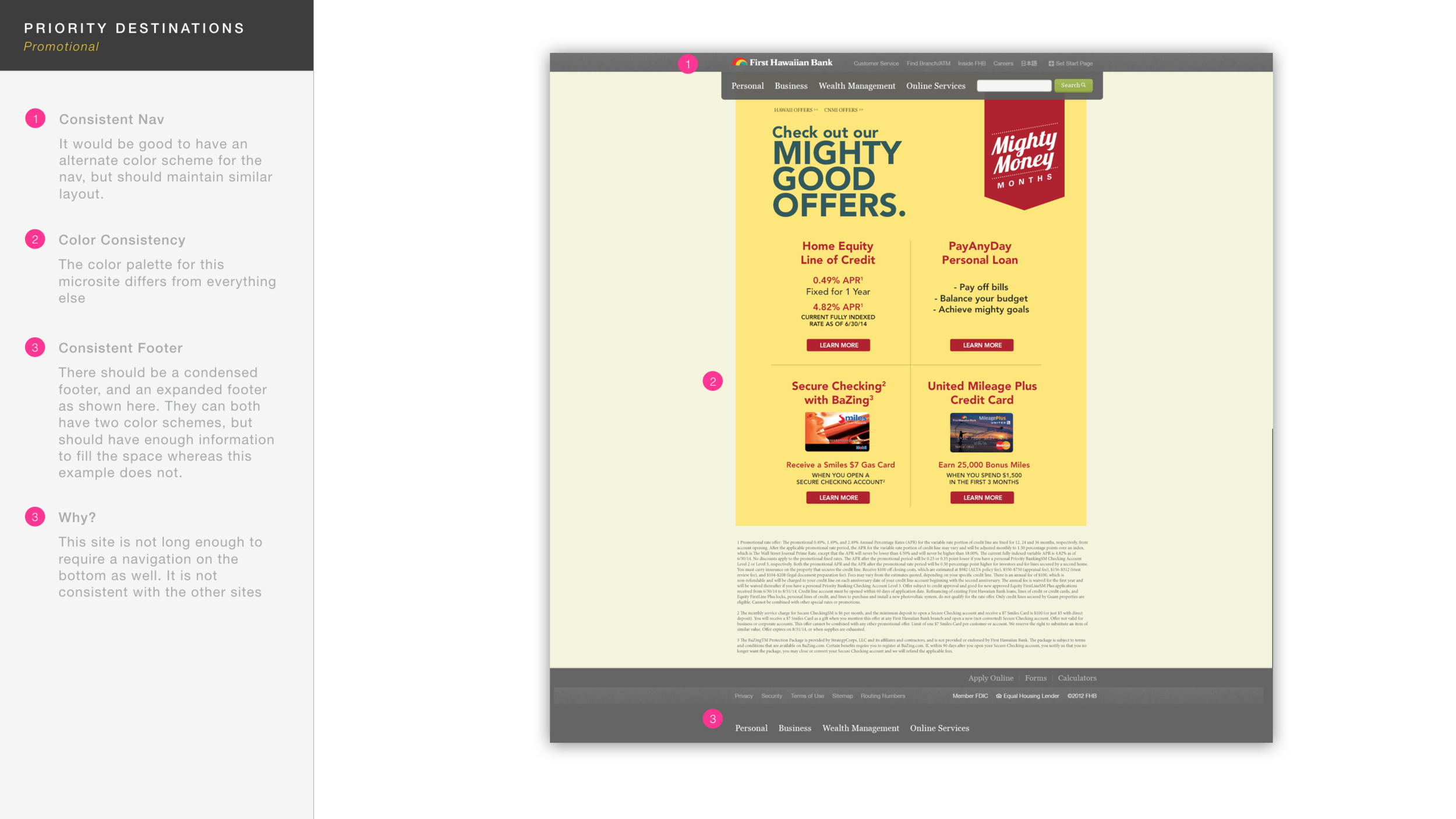
1. Navigation & Footers
There were 3 identified navigation styles and 4 different footer styles. Besides creating a consistent pattern, it was also difficult to get back to banking from one of the landing pages. I felt that the navigation should be exposed and consistent on every page and suggested we update the information architecture as well after a competitor analysis.
2. Consistent Banners
There were 4 identified banner styles. Some had none, some had full width banners, others did not, and images were even cut off on many. Even the banners that were full width then had differences in what kind of type they included. Some had no text, some had three lines and a description. There were too many differences and a pattern needed to be decided on.
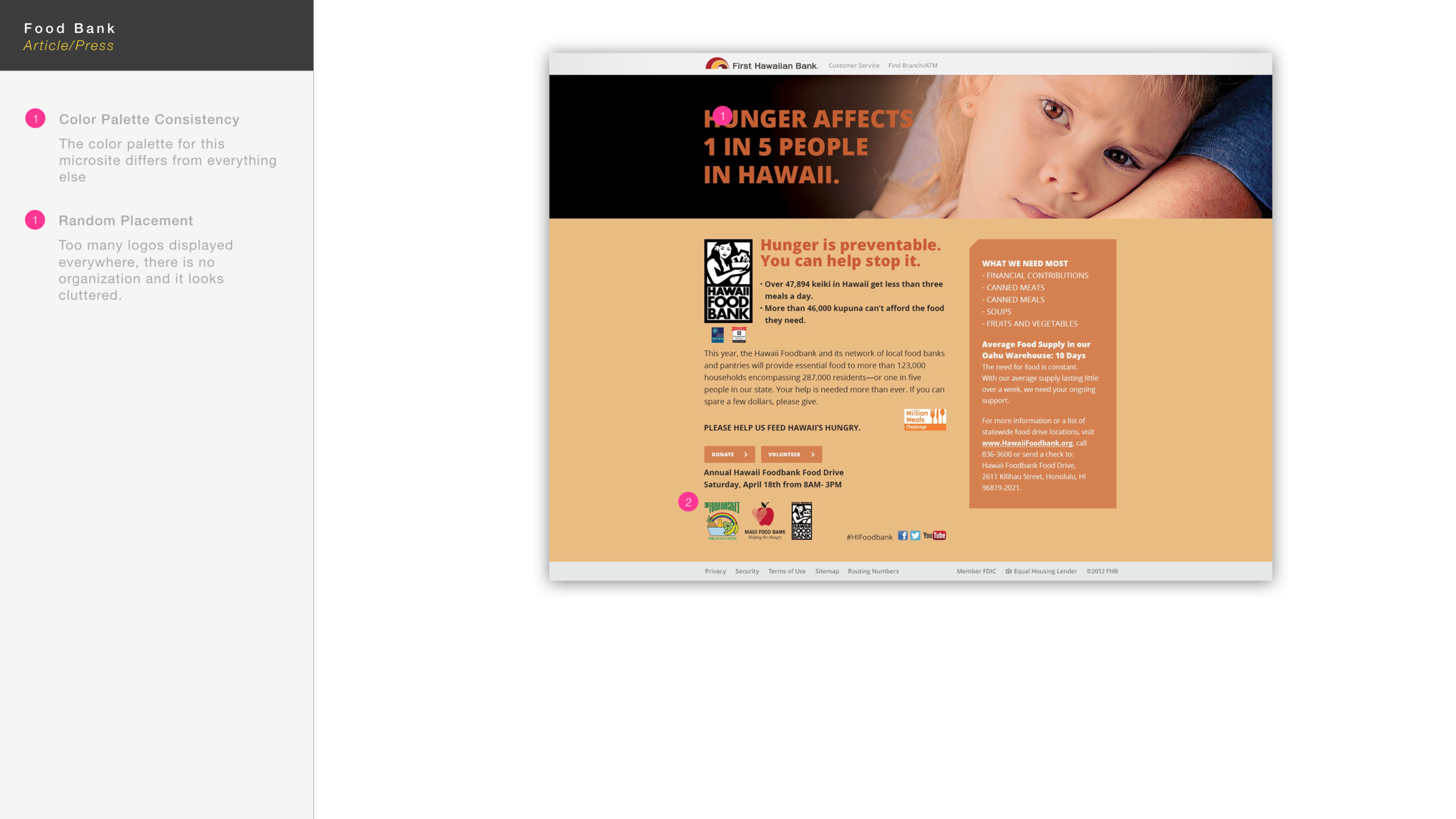
3. Large Yellow Fields
Some promotions had large yellow fields that were reserved for the main content. The yellow was alarming for banking, and it was hard to read text against such a harsh background. They had other options available, so I suggested if they use a color block, to use the dark rich red instead.
The Result
I was able to create high fidelity wires that showed how content could be used in a consistent way to meet the needs of various promotions.
“Jennifer dives whole heartedly into every project she takes on. Her skills are not the only thing that make her a fantastic UX Designer. It’s her empathy, passion and dedication that ensures the success of her projects. In her time at MVNP she not only created great experiences, but taught the rest of our creative team to think about the user first and helped establish a UX process in the company. We were incredibly lucky to have her and anyone else would be too.”